
Buckets
A head-to-toe app redesign
Overview
Buckets is a scannable digital card that simplifies social networking by allowing users to customize what social information they’d like to share. Our team was tasked with creating a new and cohesive design that is intuitive for users. We had two goals:
-
Assess the usability of Buckets current MVP and gather insights from users
-
Create a seamless application that will lead to customer satisfaction.


What's Buckets?
Buckets is a mobile app that fosters genuine connections by simplifying social networking with in person connections. Users can consolidate their social information into a customizable 'bucket' or 'mobile card,' enabling them to selectively share their details with different audiences. This innovative approach enhances safety and convenience, streamlining the connection process with its 'Save to Wallet' feature.


Using the information from the user interviews, we created a persona to represent our target users. Let's meet Dana!
Representing Our Target Users

Needs / Wants
Goals
-
Wants to categorize her social and professional connections
-
Wants to have all of her contacts in one place
-
Wants to easily update her contact information and share with connections
-
Make new connections socially and professionally
-
Be more organized when managing her contacts
-
Have control over what information is shared with connections
Dana Kimball, 26
Dana often struggles to remember everyone she meets and feels uncomfortable interrupting conversations to exchange contact information later on. She values keeping her contacts well-organized and wants a convenient and safe way to effortlessly share contact details with the various individuals she encounters.
So, What’s The Problem?
How Can We Solve It?
After establishing Dana’s current problem, we created these how might we statements to form the backbone of the design direction we decided to pursue.
Having established the main purpose of the Buckets app -- to share, receive, and organize contact information -- we needed to narrow down exactly what users needed in the app in order to achieve that purpose.
We combined the insights we found from our user interviews, heuristic evaluation, and analyses to create an MVP chart. This chart highlights what the app must do by our deadline.
Establishing The MVP

Dana needs a secure and seamless way to share, receive, and organize her contact information all in one place so that she can easily make new connections.
How might we securely streamline the contact receiving and sharing process so that Dana can easily keep track of her new connections?
How might we give Dana a simplified way to control what contact information she is sharing so she can quickly organize and manage her connections?
Organize
Manage

Create
Based on the usability test of the current MVP, we found that implementing onboarding would be an important factor in the redesign. To ensure users like Dana have a seamless flow through the app, we highlighted the three key features using benefit-oriented onboarding. These cards show the users ability to create personalized bucket cards, add bucket tags, and organize their contacts through folders.
Creating Onboarding

Our team conducted a design studio where each member ideated visual designs that could possibly solve the problems users were facing. Once each member completed their sketches, we compiled all of our ideas into one cohesive design that we felt could best improve on the apps current structure.
Sketching
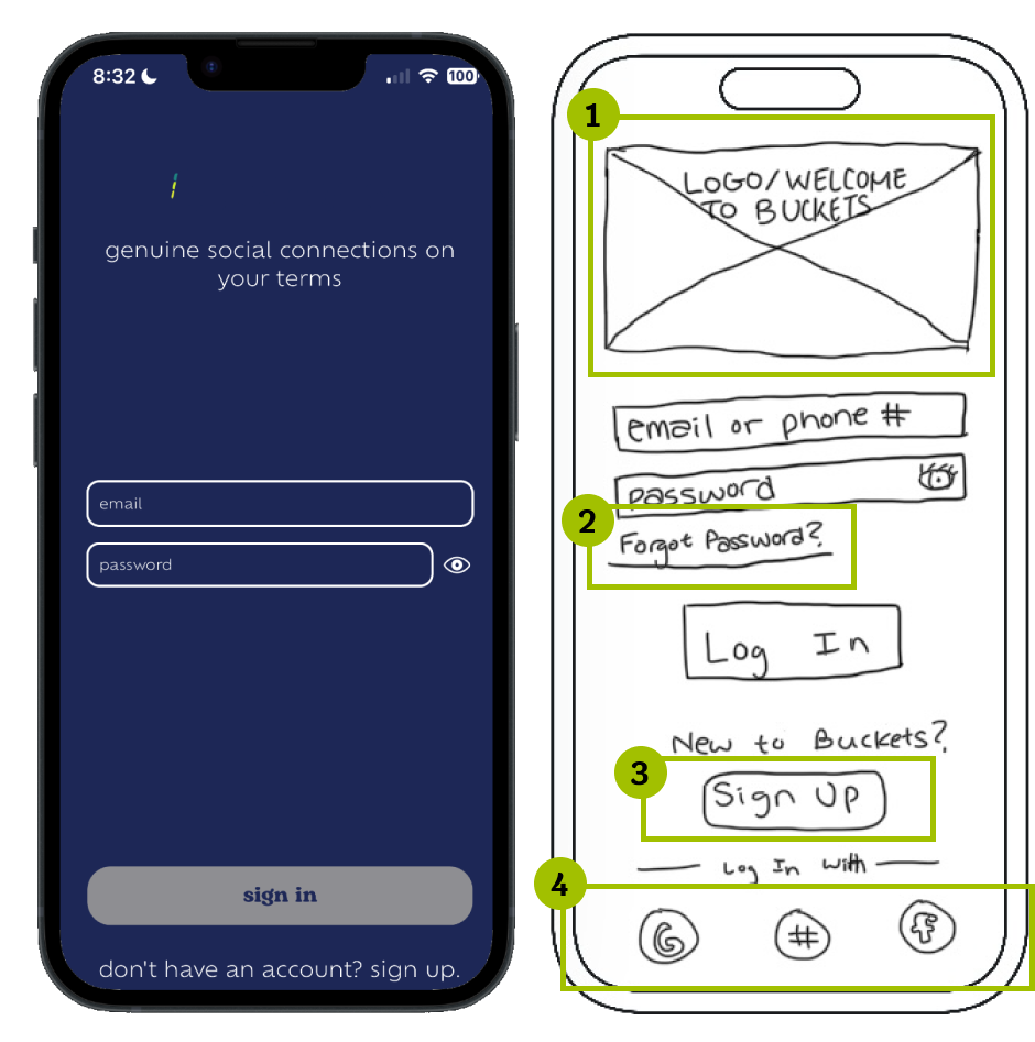
-
Logo for recognizability
-
Option to recover password
-
Easy to see “Sign Up”
-
Quick sign on ability
Login / Signup
Home
-
Ability to add multiple cards with different information
-
Home navigational icon

Contacts
-
Changed name of page from "manage" to "contacts"
-
Ability to search, sort, filter through contacts
-
Folder feature for further organization
-
Contacts icon


User Flow: Create bucket card & add it to apple wallet.
We chose this task to see if users could easily create a bucket card and share it out to their apple wallet.

User Flow: Create an Account.
It was important for users to be able to quickly create an account and get started with the Buckets app. We chose this task to test the efficiency and usability of the sign-in process.

Once we collected our refined sketches from the design studio, we turned them into a mid-fidelity prototype. We wanted to make sure that our changes were effective and accomplished our purpose before we solidified the new design in hi-fi.
Testing Our First Prototype
User Flow: Find and watch a video on how to use a specific product.
We chose this task to see if users could easily find the how-to-videos section.

User Flow: Locate contact list and add new bucket tag to Jina.
We chose this task to see if users could navigate to the contacts page, as well as to test the efficiency and usability of the bucket tag feature.

User Flow: Locate work folder and add Cindy.
We chose this task to see if users could navigate to the work folder, as well as to see if users could easily organize their contacts into their folders.


We also made note of participants likes and dislikes during the test. Here are some quotes directly from our users:
7/7 users were able to complete all tasks successfully
Average time to Create Account: 30 seconds
Average time to Create Bucket Card: 1 minute
Average time to Add New Bucket Tag: 22 seconds
Average time to Add New Contact To Folder: 20 seconds
SUS Score: 88.2
We measured success rate, time to complete tasks, and SUS scores
After developing our mid-fidelity prototype, our team conducted moderated in-person and remote usability testing with 7 participants. We gathered both quantitative and qualitative feedback in order to measure the overall efficacy of our redesign.
What Users Said...
During our usability test we also collected several key takeaways on what worked and what didn't. Using this data, we were able to form a few recommendations on how we could fix these problems in the next iteration.
What Didn't Work & What's Next?

User Flow: Find and watch a video on how to use a specific product.
We chose this task to see if users could easily find the how-to-videos section.

We got quite a few insights about our prototype from our first round of usability testing. We then implemented several changes based on those insights when going into our next design iteration.
Making Design Changes Based on Insights


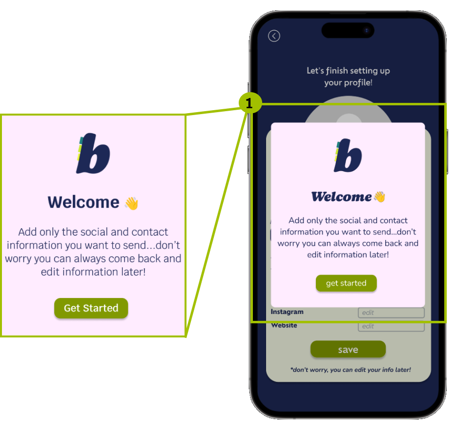
-
Popup informs users that filling in additional contact info is optional and can be completed later
New contact information popup
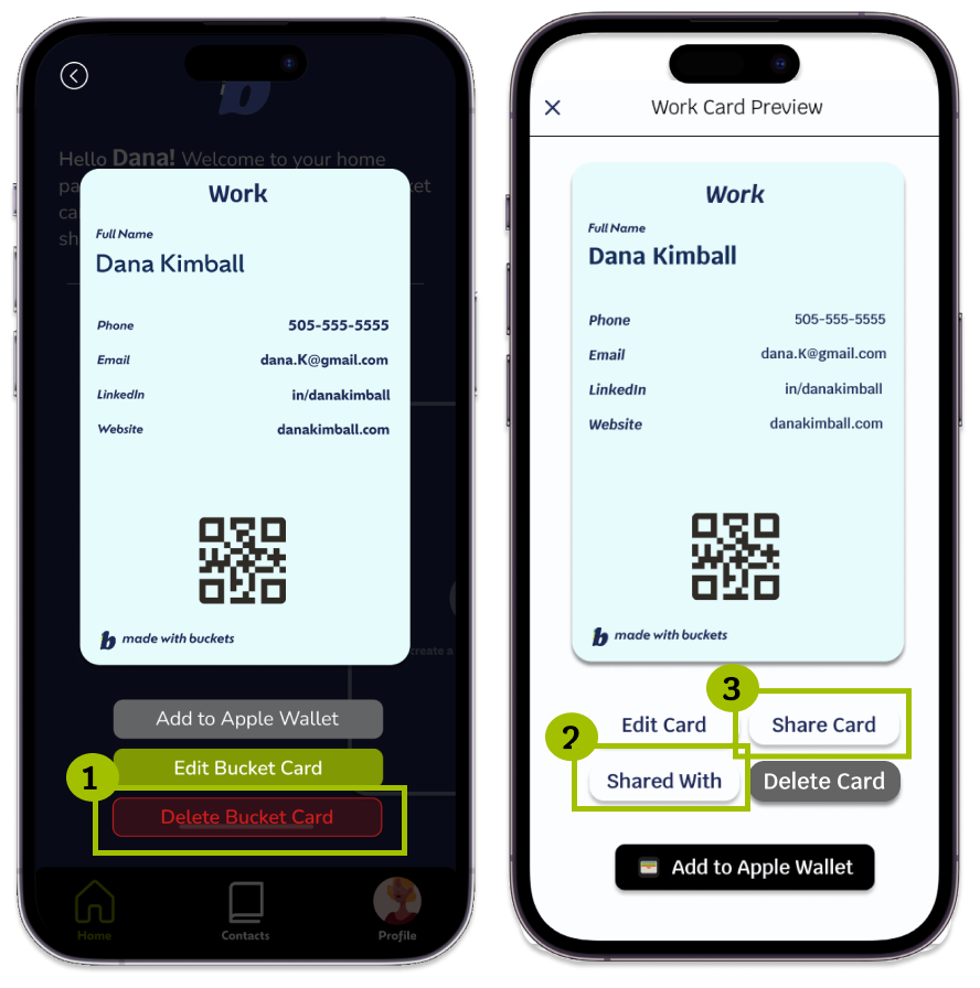
-
Changed delete button across all screens to up contrast & accessibility
-
Added different avenues of card sharing
-
Users can now see who in their buckets contacts their cards are shared with
Updated bucket card preview screen
-
Swipe right to delete a contact
-
Swipe left to save a contact to a folder, or create a reminder
Updated contact profile page
-
Reworked edit button into a “New Tag” button.
-
Added a section for users to be able to create reminders to reach out to their connections.
Updated contacts page

After finishing up usability testing and making iterations based on the results, I then consolidated everything into a new and improved hi-fi prototype.
Hi-Fidelity Prototype
Prototype Preview

After completing another round of usability testing on our new hi-fi prototype, we would like to look into streamlining the process of adding users that may already have the application. We would do so by implementing an embedded camera within the app to be able to scan and share bucket cards, while also providing users with other avenues of sharing cards such as through a uniquely generated link or their social media.
Next Steps
-
Users may choose to either “Scan” a users’ QR code or “Share” their own.
-
With permission, camera function allows users to scan others QR code.
-
Added navigational button to Scan/Share page.
-
Multiple avenues of sharing through other platforms and customizable link.
Implement Scan + Share Feature

Calling back to our MVP chart and user interviews, we also gathered a list of features that would be interesting to work towards adding to this application in the future.
Looking Forward...
Allows users to integrate the reminders they have made with their connections to sync with their Google Calendar for clear and easy viewing of any important dates.
Google Calendar Integration

Users may import their pre-existing contacts to make adding connections they have made prior to downloading Buckets.
Importing Contacts Feature
Conducting additional testing allows us to see if the iterations made clarifies Buckets specific jargon and the overall flow of using the app.
Additional Usability Testing
Option for users to draft AI generated text and emails to make reaching out to new connections easier.
AI Generated Emails / Text

coming soon
Reflection
Analyzing The Competitors...
We began with industry research to uncover trends in contact management. Most apps prioritize existing connections over new ones, but Buckets stands out by promoting meaningful, face-to-face interactions in today's tech-driven world.
We found that the main purpose of contact managements apps is to allow user to organize and prioritize their connection. Most contact management apps focus on keeping track of connections you already have, rather than making new ones.
In an increasingly tech driven world, users often form superficial connections with those they may not have even met. Buckets aims to stands out from it’s competitors by encouraging users to connect face-to-face.
Examining the Current Product
It was important to establish a baseline comprehension of the product, so I conducted a Heuristic Evaluation of the current Buckets app in order to assess its usability. I found quite a few usability issues that we would focus on fixing in our new design.
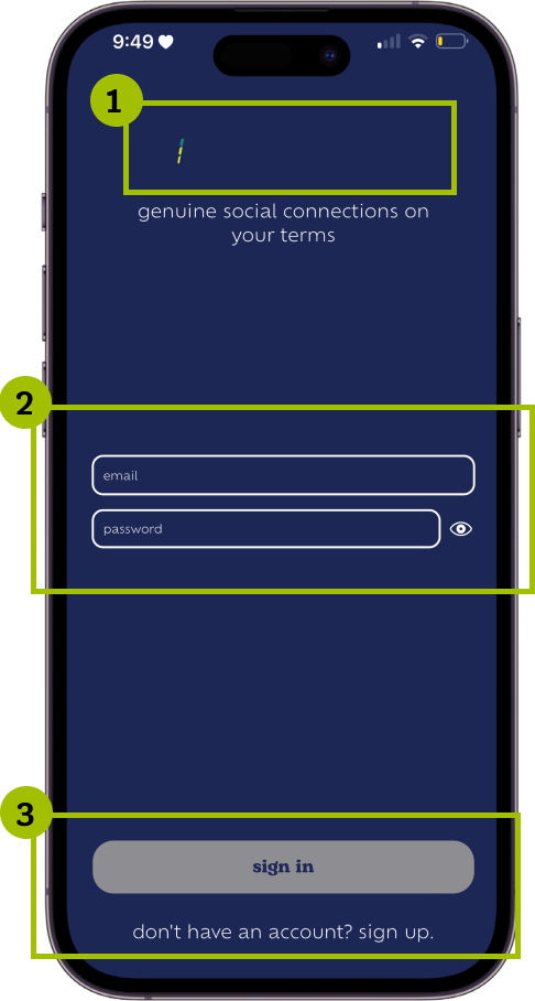


-
Logo is not visible because it matches the background color
-
Input fields are different sizes
-
Grey button and sign up prompt look like they are not clickable
Login Page
-
Lack of contrast between text and background makes it hard to read.
-
Some CTA’s are missing labels
-
Menu icons sizing is inconsistent
Create Pass Page
-
Profile image is very small
-
CTA’s are small and hard to read
-
Lack of adequate spacing between elements makes it feel cramped
-
Lack of confirmation for completed actions
Profile Page
Understanding Buckets' Users
After we identified buckets position in the industry, our next course of action was to conduct user interviews in order to understand users habits and preferences when it comes to exchanging and organizing contact information. Out of our 10 participants, we found 3 key trends.

-
Users value privacy and control over their information
-
Users add keywords and notes to contacts so they can easily find them later
-
Users want to locate and organize contacts quickly
Synthesizing Interview Findings
To further empathize with our users, we distilled our research findings into “I” statements -- which are statements from the user’s point of view that describe their needs, wants, and frustrations with the goal of building an experience that truly resonates with our users.




“I want to have control over my personal information and who can access it.”
“I want to be able to share and receive contact information quickly and effortlessly. ”
“I like to be able to add important information about my contacts to reference later.”
“I find it hard to keep my contacts up to date and organized”
Overall, the Heuristic Evaluation was quite fruitful, and following it we were able to make a "To-Do List" list of actionable items that we would like to implement in order to make the buckets app more user friendly:
-
Re-align elements to be more consistent throughout each page
-
Re-size text so it is easier to see
-
Re-color text and buttons to be more accessible while maintaining fidelity to the brand style
-
Confirmation prompts to indicate user completed a task
-
Onboarding to create clarity on Buckets specific jargon (i.e. “Bucket Card”)
