ULTA Try-On Redesign
A conceptual design challenge
Overview
ULTA Beauty’s mission is to inspire people of all ages, genders, abilities, and skin tones by redefining beauty, and encouraging confidence and self-expression. For this design challenge, we have two goals:
-
Redesign or create a new feature for the ULTA mobile app.
-
Increase customer engagement, retention and sales through the ULTA App.

This case study is purely conceptual. Any work represented here is not associated with nor endorsed by ULTA
%20copy.png)

My team’s first step was to talk to actual ULTA customers. Through our user interviews, our goal was to gain insight on how customers currently interact with the ULTA app, as well as what could be improved.
Gathering Insights From ULTA Users
Using the data from our user interviews, we gathered our insights and grouped them together based on theme using an affinity map. There were quite a few noticeable trends between users. We turned these trend into “I” Statements to summarize these trends.
Synthesizing Interview Findings
We also wanted to get an idea of features customers appreciated in competitors apps, so we conducted a C&C analysis. One surprising thing we found while conducting our analysis was that ULTA actually had a virtual try-on feature already. However, we stumbled across it almost by accident.
Analyzing The Competitors…
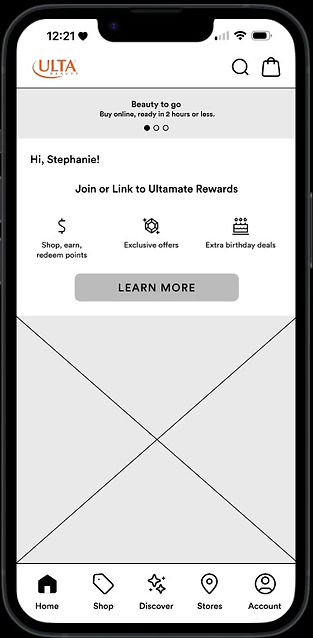
To find out exactly why the virtual try-on was so hard to find, we decided to do a heuristic evaluation on the ULTA app. We found that there were no clear directions or labels that pointed users to the virtual try-on feature, and it was on a page that made user scroll all the way down the page to locate it.
We also noted that we had a hard time seeing a few of the CTA buttons in the app. As you can see on the left, our competitors have prominent and filled CTA buttons, whereas ULTA’s buttons blend into the background due to the lack of color contrast.
Why Was The Virtual Try-on So Hard To Find?

-
Finding the personalized beauty quizzes and virtual try-on was VERY difficult.
-
Competing apps also have a virtual try-on feature.
-
Ulta lacks in curated items.
Our Findings
-
We recommend improving the informational architecture of the navigation
-
How can we improve our virtual try-on feature?
Conclusion

.png)
Our Competitors
ULTA

Using the information for the user interviews, we created a persona to represent our target users. Let's meet Stephanie!
Representing Our Target Users

Stephanie, Marketing Manager
"I don't have time to waste on things that don't work."
Needs / Wants
Behaviours
Stephanie is a 27 year old marketing manager for a small start up in Brooklyn, NY. She spends her free time hanging out with friends, often dressing up and going out.
-
intuitive navigation
-
a way to test things before buying them
-
reads reviews before buying
-
browses products
-
orders new makeup from her phone
Stephanie’s main concerns are that she wants to save time and money when purchasing makeup. She wants to make sure the makeup she’s buying is flattering on her so she can avoid having to go through the hassle of returning products she doesn’t like.
So, What’s The Problem?
How Can We Solve It?
After ideating on several different ways we could solve Stephanie’s problem, we decided to do so by:
-
making the virtual try-on easier to find
-
improving user’s experiences when using the virtual try-on feature
Before we could move on to designing our solutions, we wanted to make sure that we all knew exactly what we were going to be focusing on.
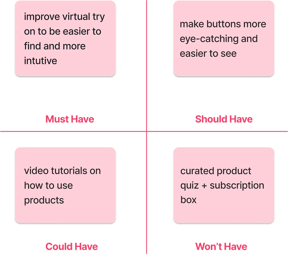
Using the 4 key insights we found in our user interviews, we created a MVP chart to categorize our information by priority and define the minimum viable product for this sprint.
Establishing The MVP

Stephanie needs access to the most detailed product information before purchasing so she can ensure she gets products that are flattering on her.
How might we improve the virtual try on feature so that Stephanie can be more confident that the products she’s buying will look good on her?

.png)


In the design phase, our first step was to conduct a design studio. The current discover page makes users scroll down to access any of the content of the page. This makes it easy for the virtual try-on to be missed, so we came up with a few different redesigns to categorize the information in a more intuitive way.
Sketching
Current Discover Page
Iterations
Our Final Pick
Our main goals was to make the Discover page clear and easier to navigate. We decided the page shouldn’t scroll, and there should be two clear options for where users can navigate to next. We placed the GLAMlab (virtual try on) as the first thing a user would see, and Beauty Tips directly under that. The Beauty Tips tab is where users would find the quizzes, trends and blogs.
Once we collected our refined sketches from the design studio, we turned them into a low-fidelity prototype. We wanted to make sure that our changes were effective and accomplished our purpose before we brought the new design into hi-fi.
Testing Our First Prototype
User Flow: Try on a purple lipstick under $25 using the virtual try-on feature.


We chose this task to see if users could navigate to the try-on, as well as to test the efficiency and usability of the new design and filters.
User Flow: Find and watch a video on how to use a specific product.
We chose this task to see if users could easily find the how-to-videos section.
To ensure we were heading in the right direction, we had 8 users test our low-fidelity prototype with the intention to see how easy it was for them to find the redesigned virtual try-on feature.
What Users Said...
6/8 users were able to complete both tasks
Average time to complete Try-on task: 3.5 minutes
Average time to complete How-to task: 26 seconds
Average SUS score: 77.5
We measured, success rate, time to complete tasks, and SUS scores

We also made note of participants likes and dislikes during the test. Here are some quotes directly from our users:
“I would like it to say try on virtually before you buy somewhere on the homepage”
.png)


We got quite a few insights about our prototype from our first round of usability testing. We wanted to implement some changes based on those insights for the second round.
Making Design Changes Based on Insights


For our second round of usability testing on the hi-fi version of the prototype, we conducted a remote moderated test with 6 users and compared the new data to see how we improved. This time around, not only were all of our participants were able to complete both task successfully, but they did so faster. Users also completed their assigned tasks with drastically less mis-clicks.
One of the most exciting things, however, is that our SUS score saw a marked improvement. It raised from 77.5 to 92.5, placing us in the excellent category!
More Testing!
6/6 users were able to complete both tasks
Average time to complete Try-on task: 1.7 minutes
Average time to complete How-to task: 48 seconds
Average SUS score: 92.5

We measured success rate, time to complete tasks, and SUS scores
.png)


We also got a couple of different quotes from our users regarding their likes and dislikes. Here are some positive things they mentioned!
For our second round of usability testing on the hi-fi version of the prototype, we conducted a remote moderated test with 6 users and compared the new data to see how we improved.
Hi-Fidelity Prototype
Prototype Preview

Calling back to our MVP chart, one thing of interest that popped up in our user interviews was customer’s desire for more personalized product recommendations. To address this, we would like to explore creating a Get-to-know you quiz.
We also came across some customers who liked the idea of personalized product boxes with products that not only work well together, but also address their individual skin care / makeup needs. Later, we would also like to implement a curated product subscription box with products recommended based on the results of the preferences quiz.
Next Steps

coming soon
